Wow - 2016 was a bit of a rollercoaster wasn’t it? I hope you managed to get through it without being too traumatised and that 2017 is much better for all of us, and the world in general. And I hope you manage to have a wonderful Christmas break.

The art of No Man's Sky
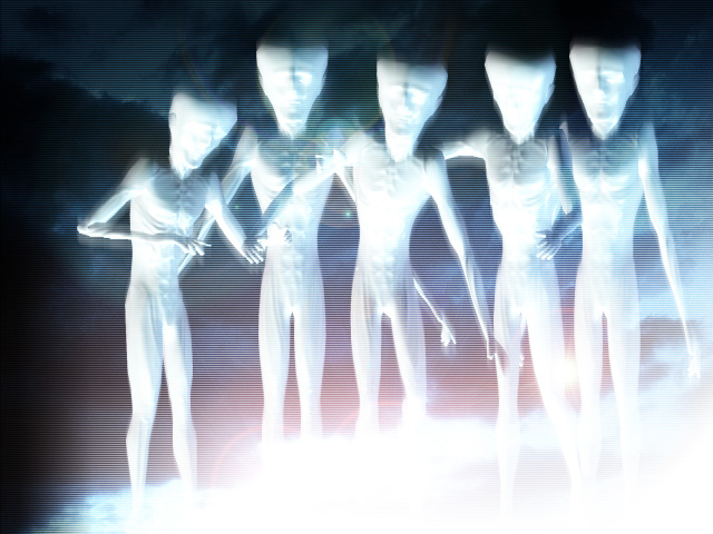
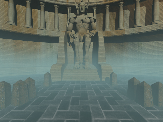
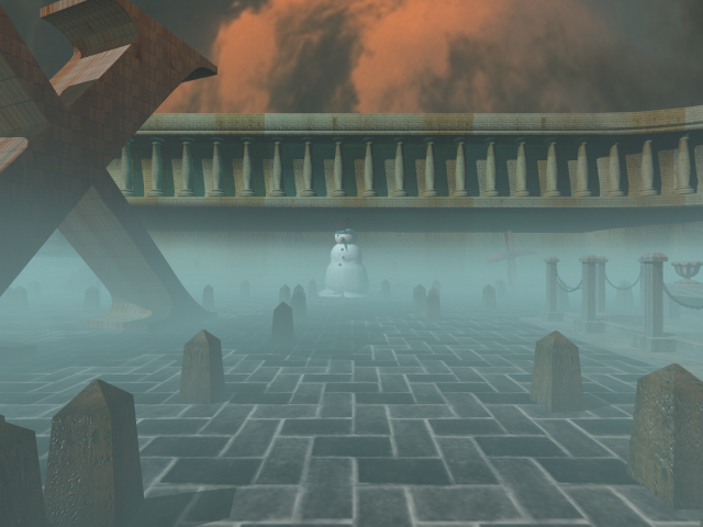
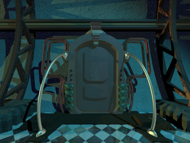
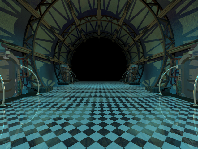
You might have heard of the new(ish) video game called No Man's Sky recently released on the PS4. It's unique selling point is that no two players will ever see the same game - you get to explore an enormous galaxy of literally billions of planets and everybody starts from a different point within that galaxy.
There's been some controversy over the actual game itself i.e. whether just flying a spaceship from planet to planet actually counts as real gameplay, but there's no denying how beautiful it all looks and what an amazing technical feat it is. The designers of game clearly have a love of classic Science Fiction book covers (like these...) which has resulted in some truly beautiful alien landscapes to explore.
Here's an article on Eurogamer detailing some of the artists the game's designers drew inspiration from. I've been enjoying it immensely from a visual perspective - so here's a few screenshots of my adventures.
There's some cool looking spaceships...
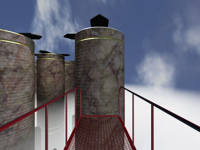
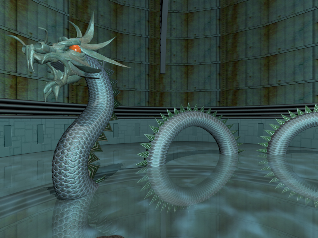
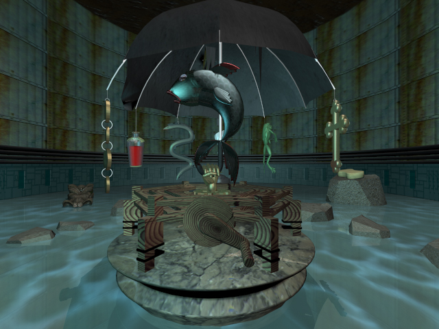
Strange alien planets to explore...
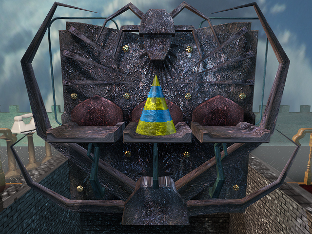
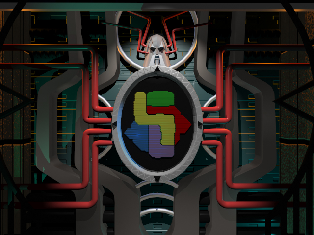
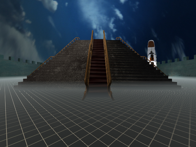
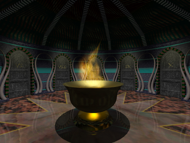
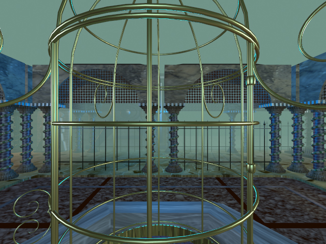
Plenty of alien outposts and strange temples to visit...
And of course you get to fly a spaceship

MicFlip 2.0 Fully Reversible Micro USB Cable
I got a great new USB cable the other day...
Now that's not normally the sort of thing I get that excited about or that I'd bother sharing with you, but this one is really clever. It's one of the micro USB ones - basically most things that aren't made by Apple use these, so despite being an Apple fanboy, I do have numerous Kindles, Playstation controllers, bluetooth speakers etc that all need charging with one of these.
All my other USB cables have a right way and a wrong way of being plugged in at both ends - so the chances of getting it right first time are pretty remote (especially in a poorly lit room).
The great thing about this cable is that both ends are reversible, so it doesn't matter which way either of them goes in... it just works first time, every time. Quite why USB cables weren't designed like this in the first place, I don't really know... It's also very well made, a nice quality braided red cable so it stands out from all the other tangle of black one, gold plated ends and it's extra long.
So if you'd like one less thing in your life to be frustrating, check it out on here on Amazon.

Weird...
Yesterday an old friend (Hi Mark) asked if I'd still got copies of some work we did together on a project called Weird about 20 years ago (20 years... wow, that went fast)
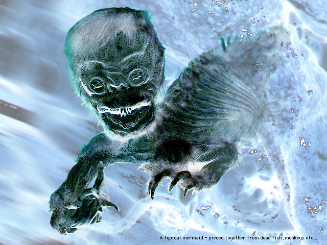
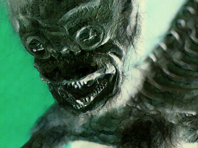
Weird was a 'edutainment CD-ROM' - a sort of cross between a video game and an interactive book about weird stuff. You explored a strange environment, clicking on anything that looked interesting to reveal a video interview, narrated slideshow or just a text based story.
I dug through my old backup discs and was surprised to find I could still open them and access all the files - I had to do a bit of file conversion (who remembers PICT files) and was surprised at how small there were: 640 x 480. Even phones have MUCH bigger screens today :)
Anyway, the process bought back a lot of happy memories so thought I'd present some of the weird and wonderful work I found.

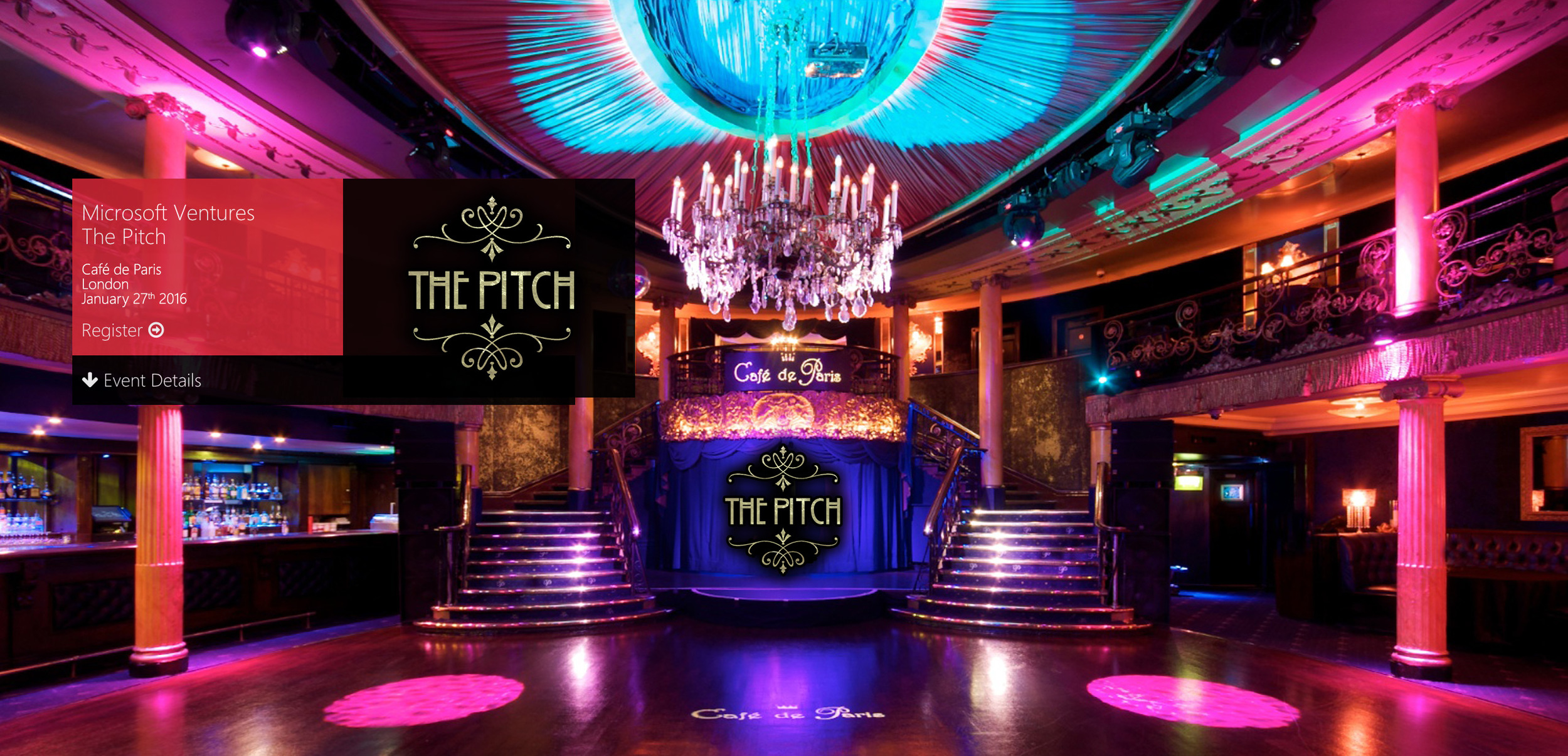
The Pitch
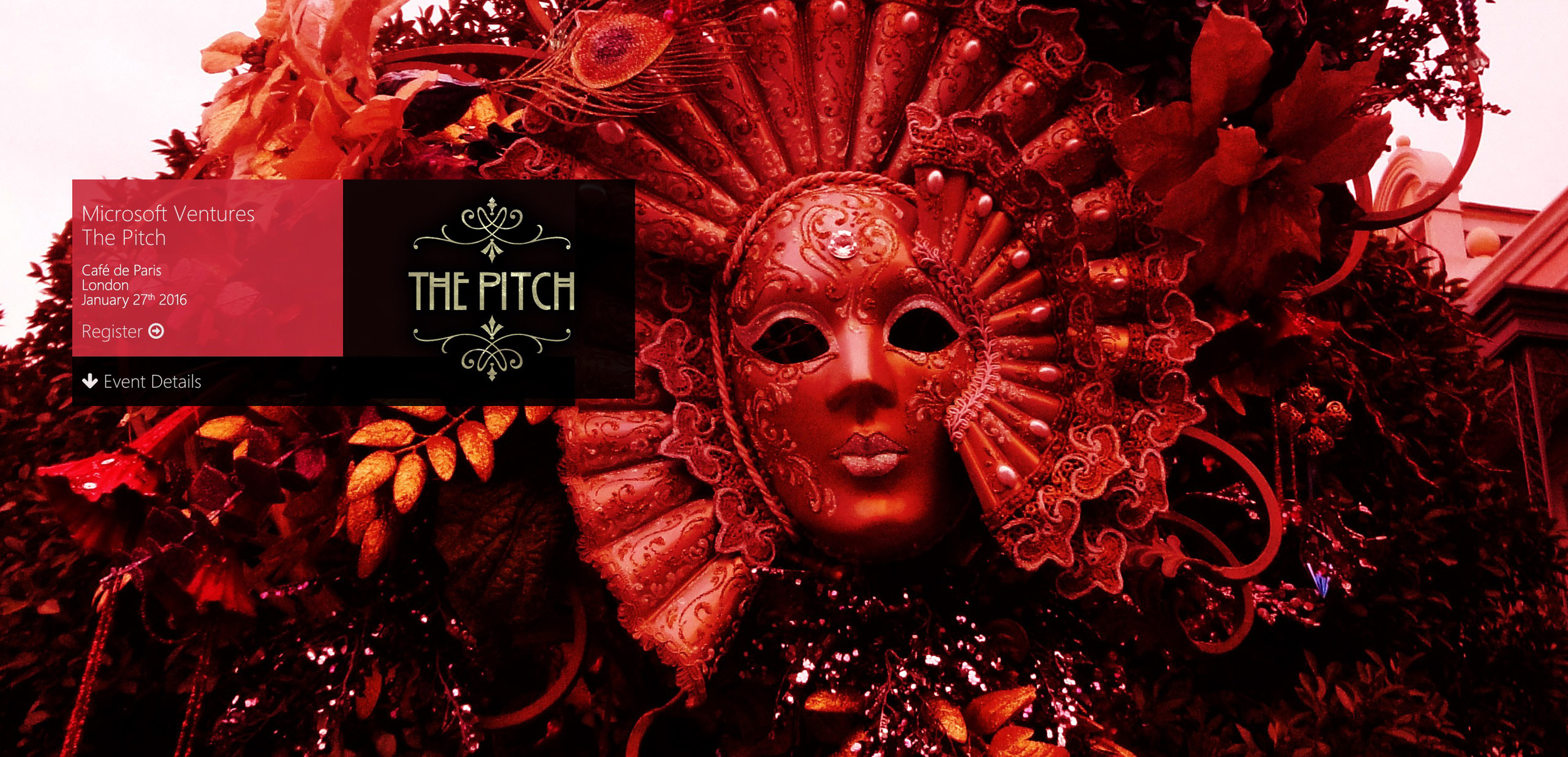
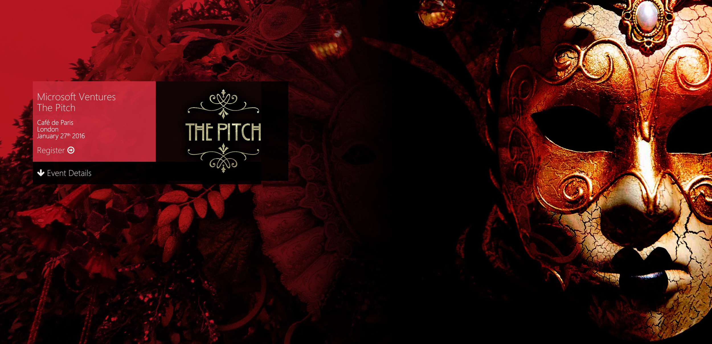
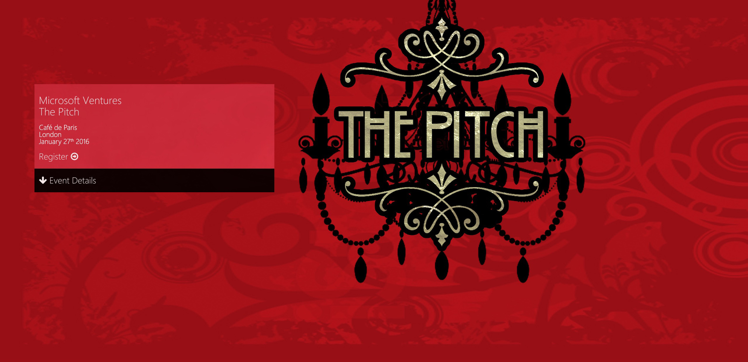
Here's some of the (many) event graphics I did for this year's Microsoft Ventures The Pitch event happening which happening last week and was organised by the wonderful folk at Forgather...
Here's the final logo
And here's some initial concepts showing how it might be used on promotional material...
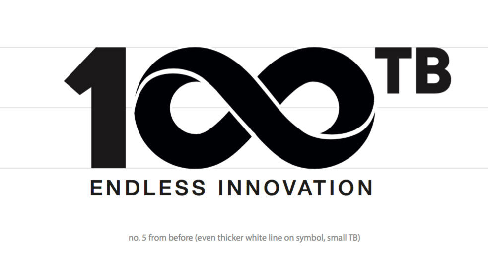
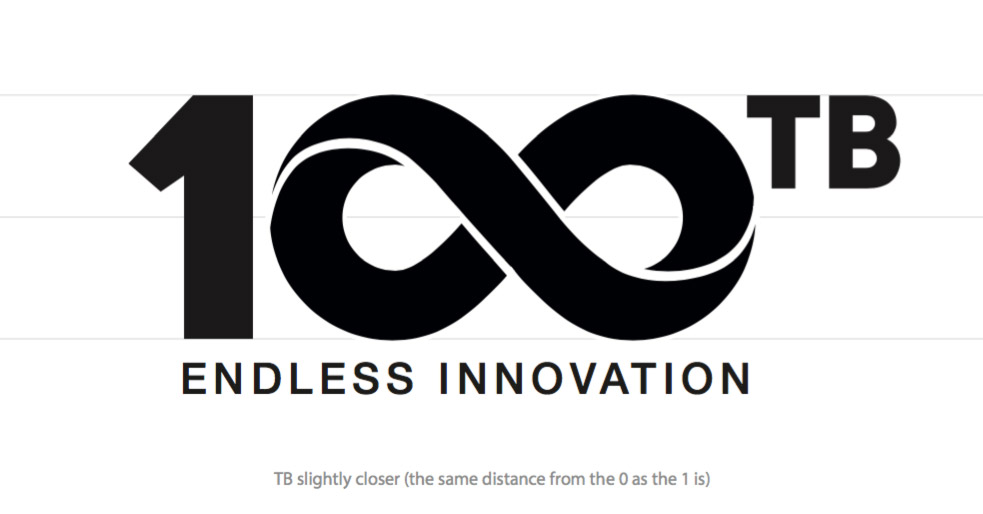
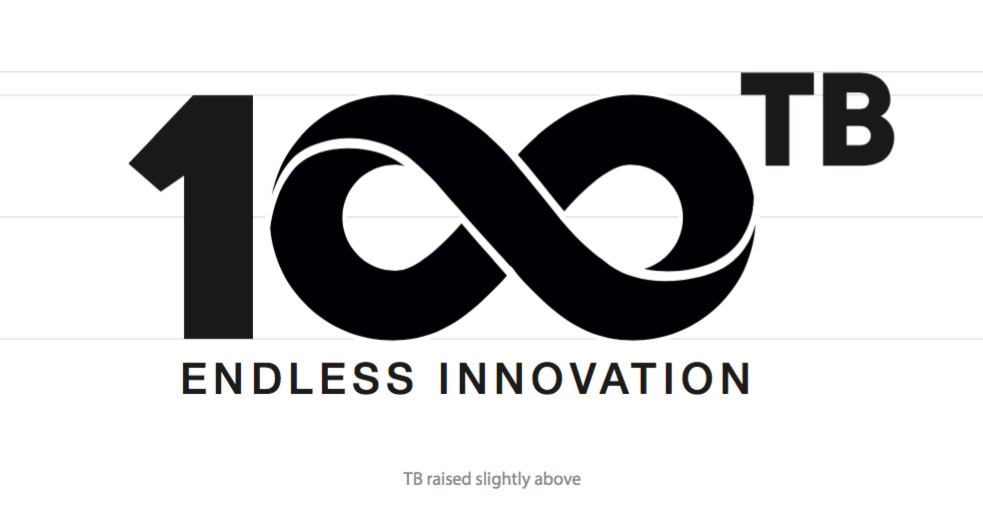
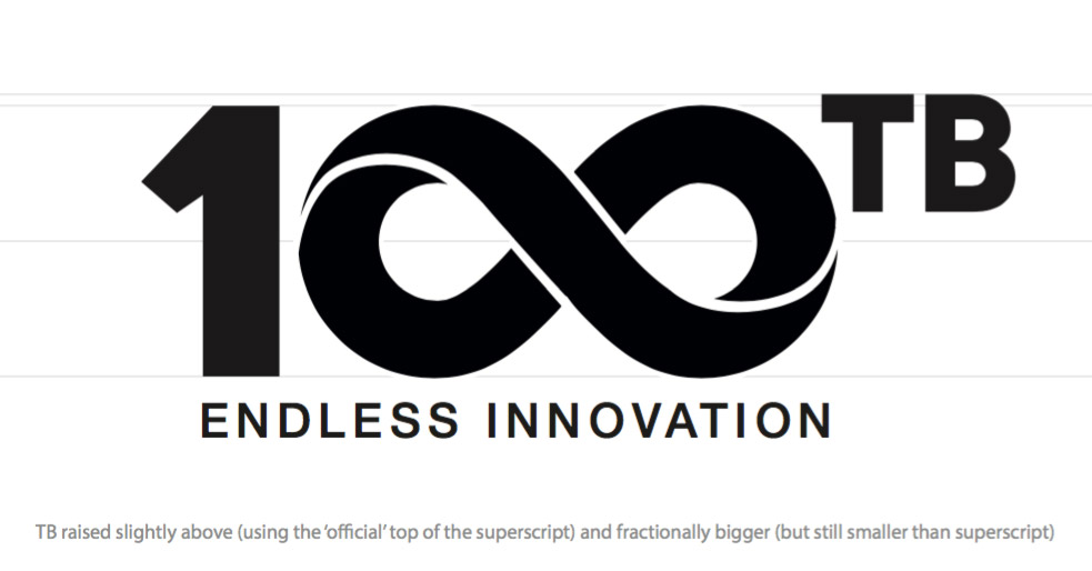
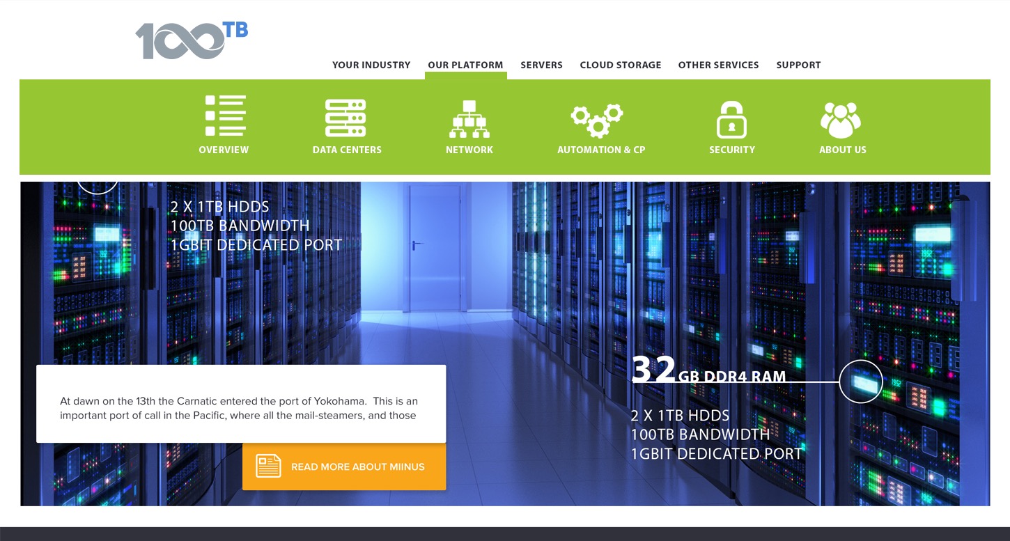
Corporate Identity Case Study: 100TB
I thought some of you might be interested in the process of designing a corporate identity. In this case study I'm going to concentrate purely on the visual side of things, and ignore the equally important positioning side - the 'who are we and how do we say what we want to say' stuff...
Please bear in mind that this is a dramatic oversimplification and that the work shown shown below only represents a tiny fraction of the actual work involved!
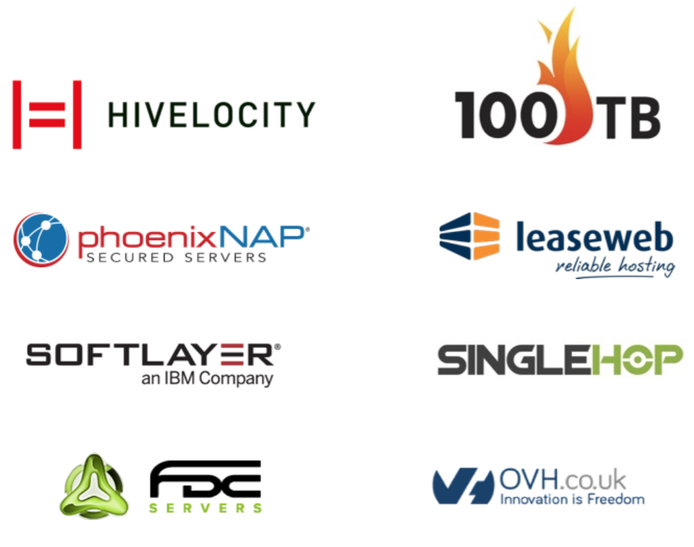
Competitive Analysis
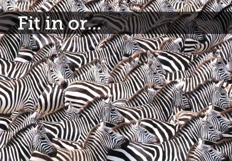
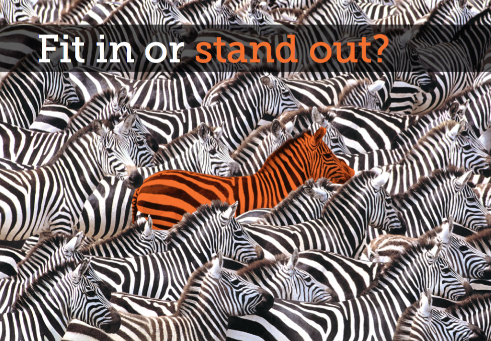
This basically involves looking at their competition and seeing how they fit in with them. One of the most important decisions any brand needs to make is whether they want to blend in with the rest or stand out from the pack.
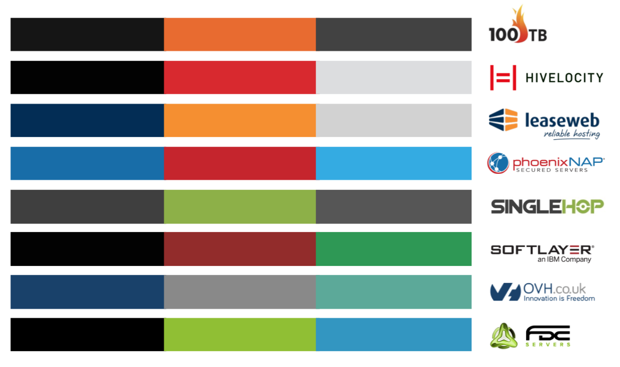
The first steps would be to collect and compare logos and other brand assets such as palettes and websites.
Initial Design Concepts
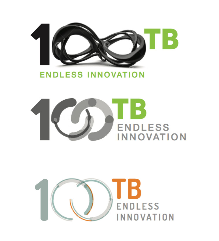
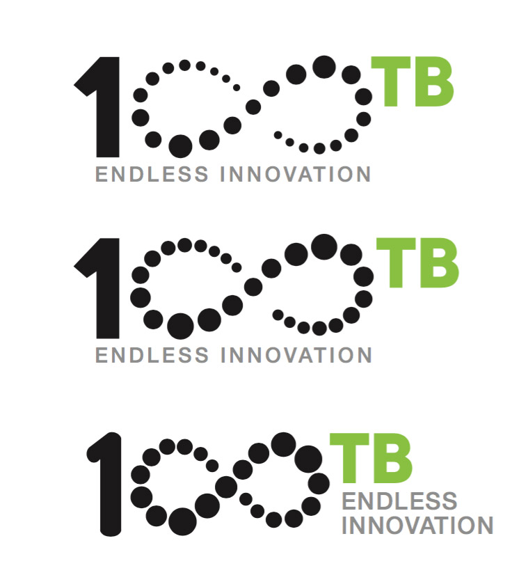
Once this process has been completed and discussed and some decisions have been made it's time to start coming up with some logo concepts. Obviously there's no end to how many ideas a client will want to see but you have to start somewhere, so it's a good idea to come up with several 'routes' and work from there.
It's also helpful to visualise how some of these routes might be expressed later on and to give an idea of what the logos might look like in situ...
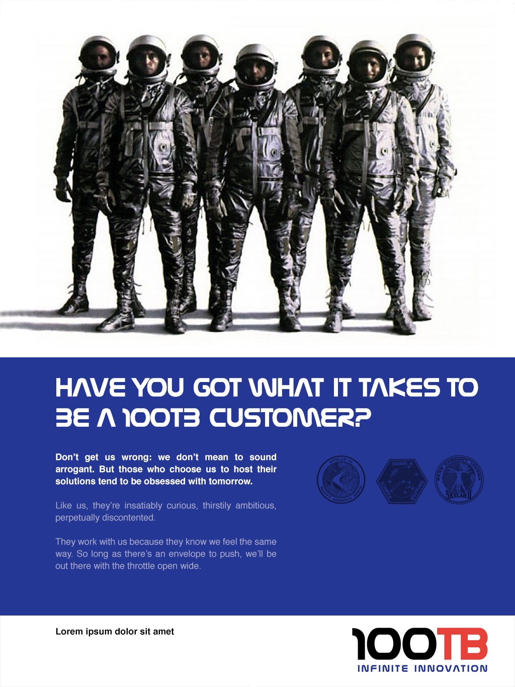
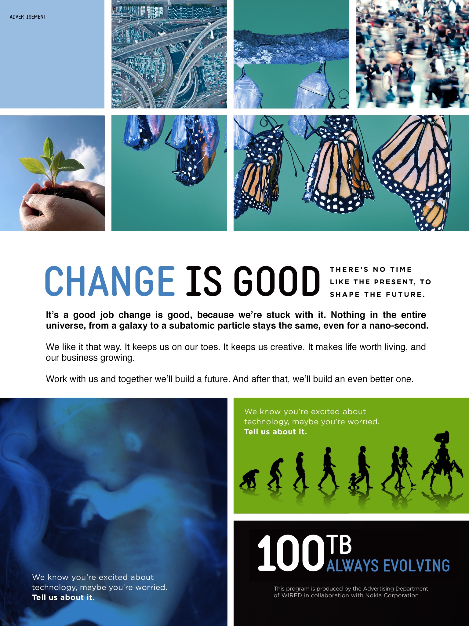
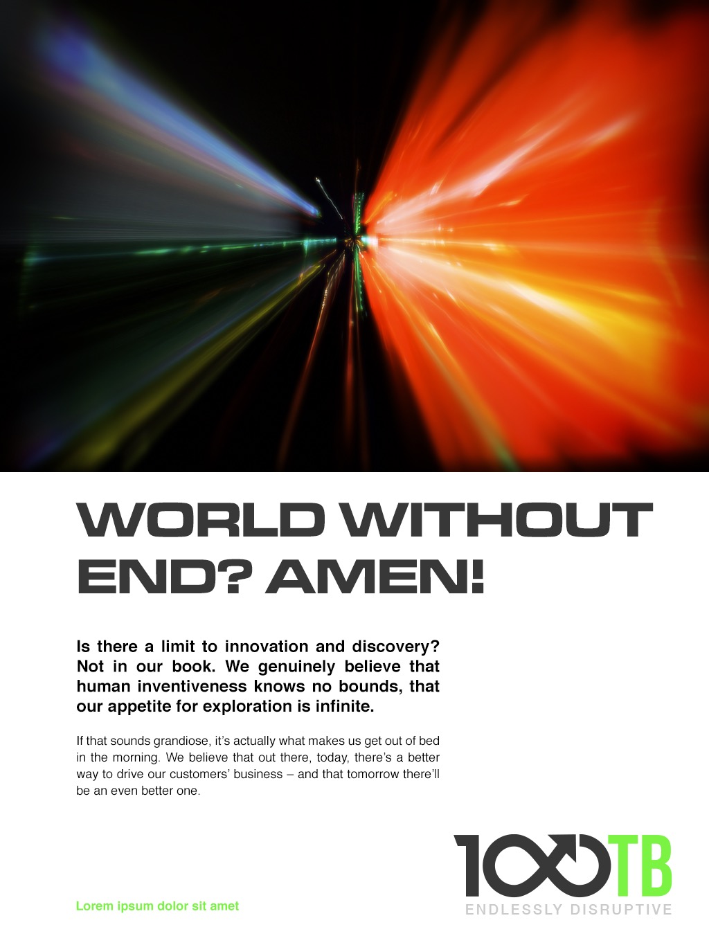
It's normally not a good idea to worry too much about colours and typefaces at this point as they can distract from the 'bigger picture' and can easily be changed later...
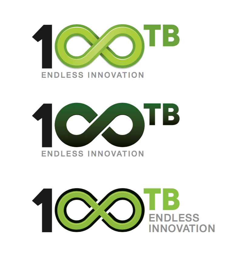
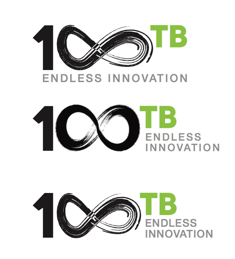
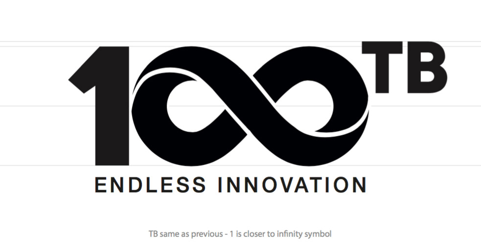
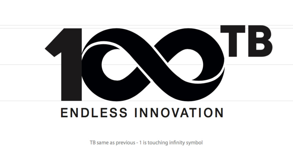
Hopefully something will catch their imagination (in this case the infinity symbol) and act as a catalyst for the next stage.
Polishing
Once a logo has been chosen it's time to start polishing it, or as I like to think of it, 'variations on a theme'. It's incredible how tiny changes can make the difference between something that looks wrong or right.
Palette
Next, it's time to think about colours and mock up some examples of how they might be used in the real world. Typically this would involve the development of a primary set of colours for the actual logo itself and a secondary palette that will work with it.


And finally...

RIP David Bowie
Yesterday the world lost David Bowie. I've been listening to my Best of Bowie playlist pretty much constantly since then which has just bought home how great a musician he was, let alone a visual icon. He did more than anyone I can think of to influence the look and feel of music during my life - and I didn't know how much I'd miss him until he was gone...
Here's an old painting I did of him many years ago
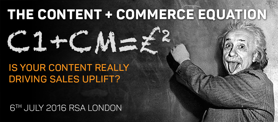
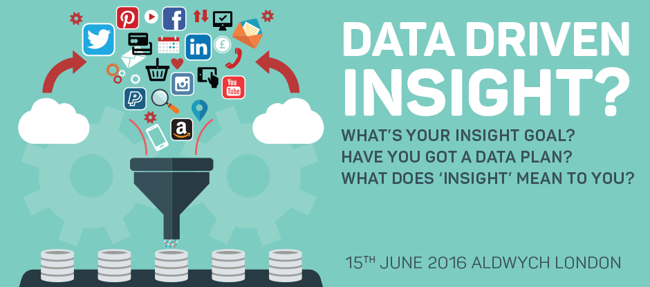
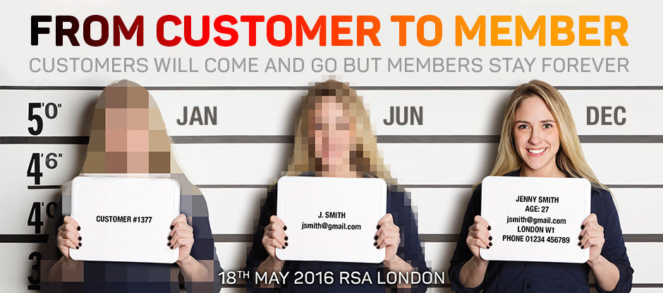
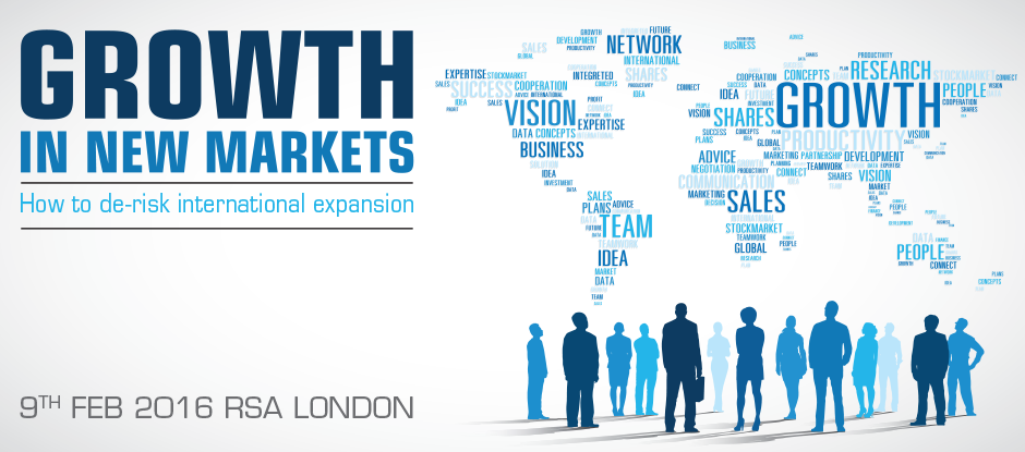
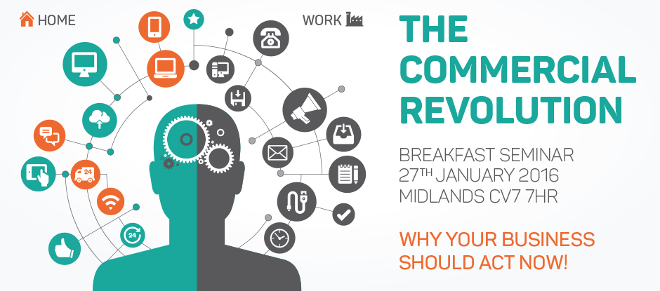
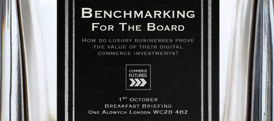
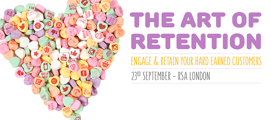
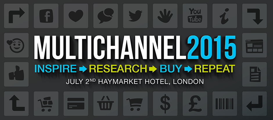
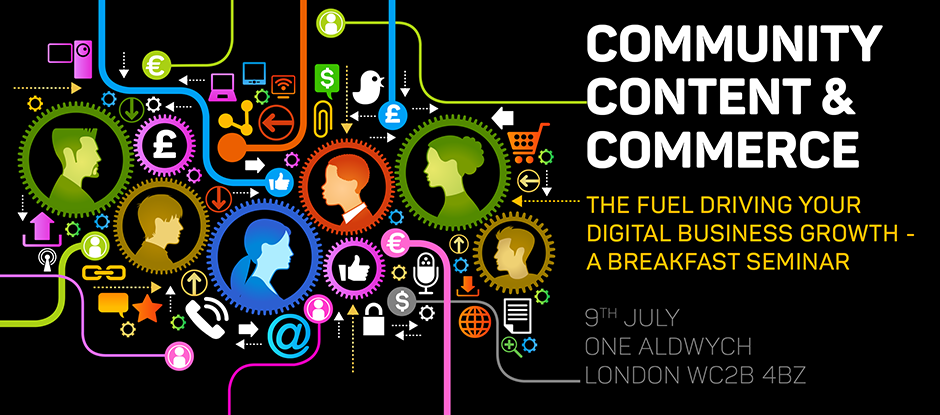
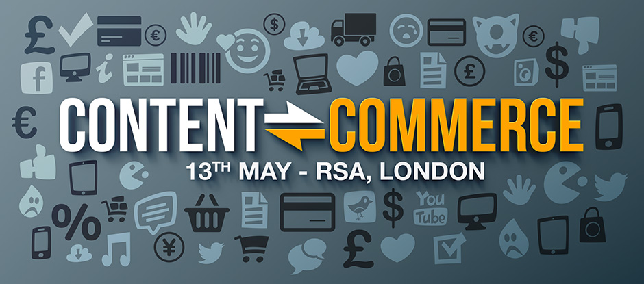
Commerce Futures Event Graphics
One of my favourite recurring jobs is designing the graphics for the events organised by Commerce Futures, so I thought the New Year might be a good excuse to revisit some of last years and have a look at some of the upcoming ones for this year...
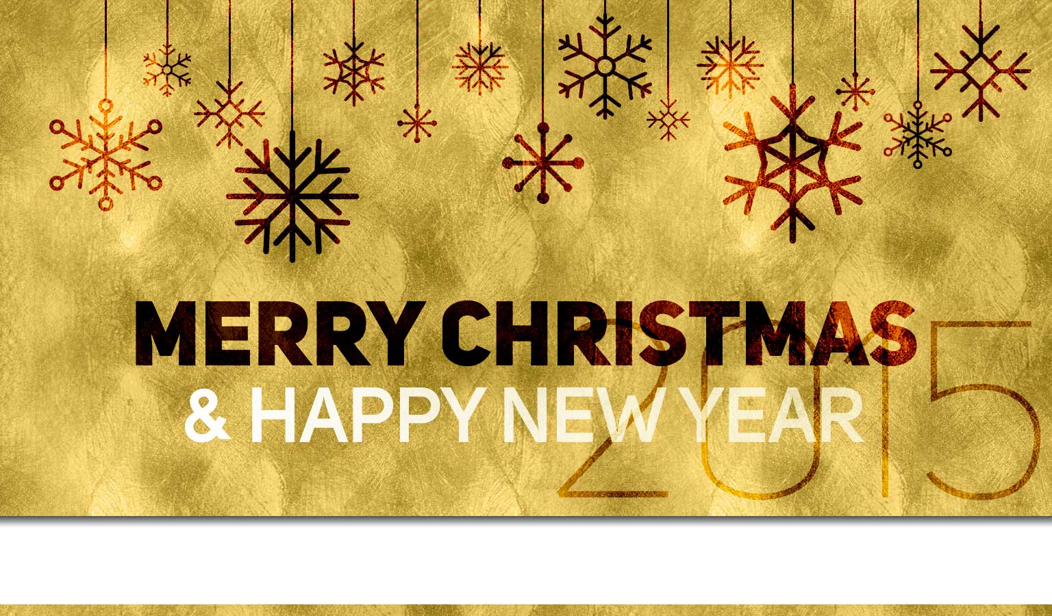
Merry Christmas 2015
I hope 2015 has been a good year for you and that you have a wonderful Christmas break.
Marry Christmas and a Happy New Year!
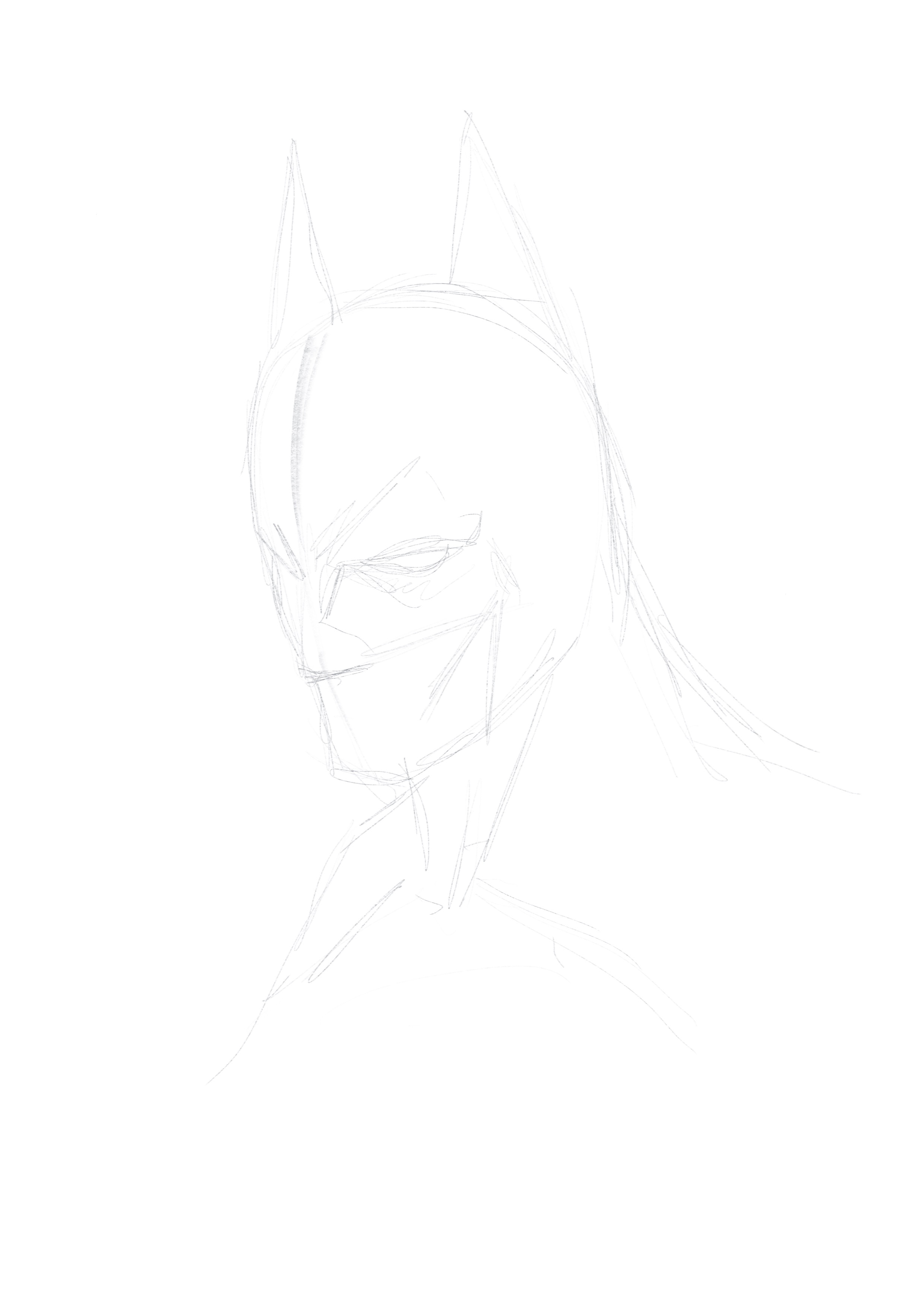
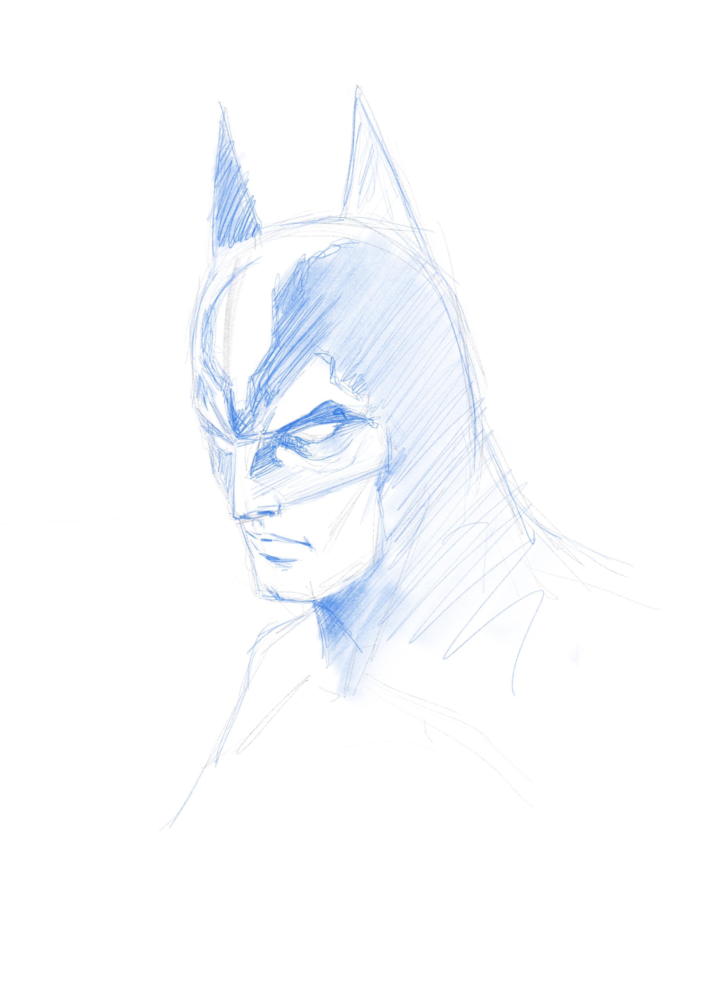
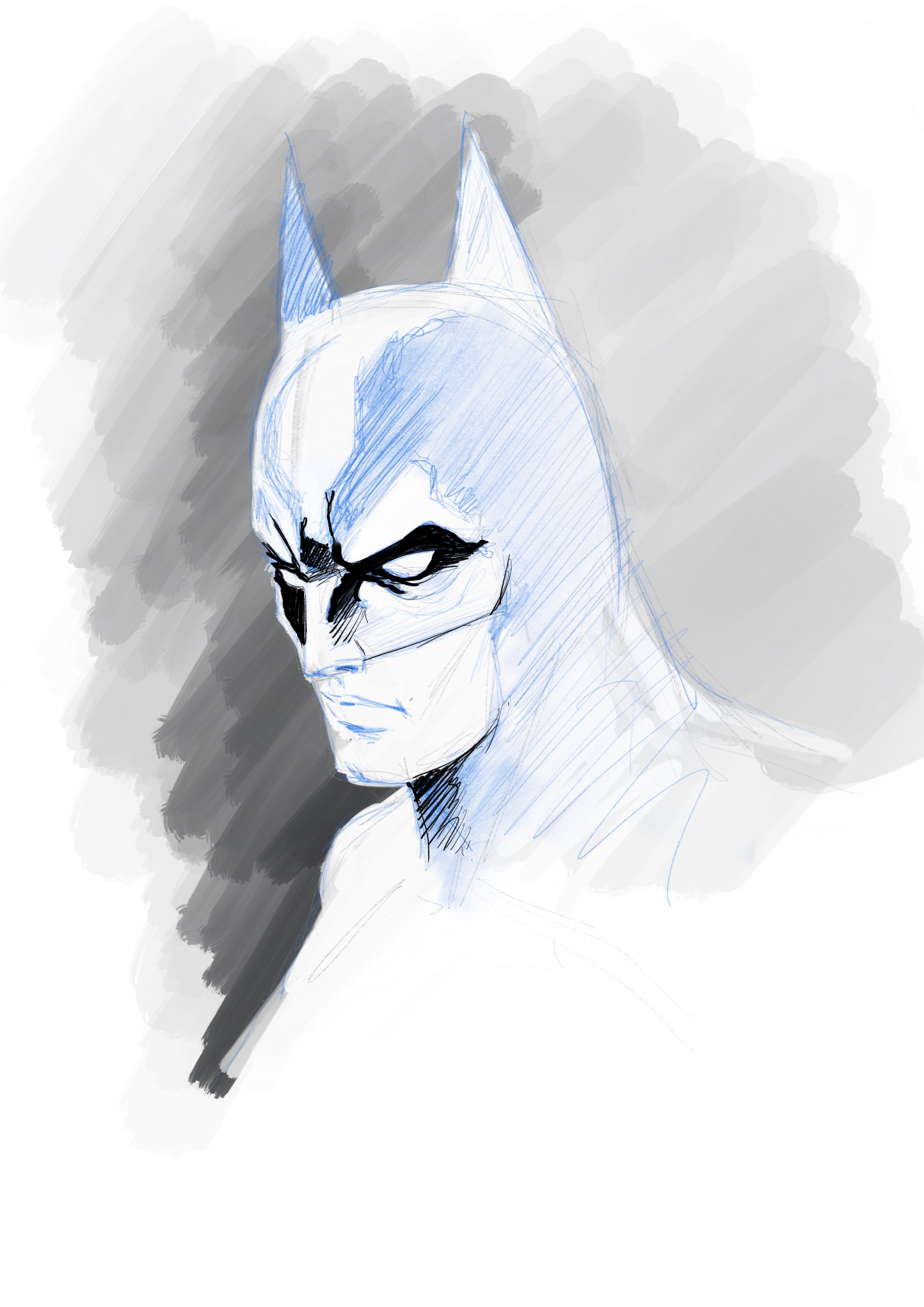
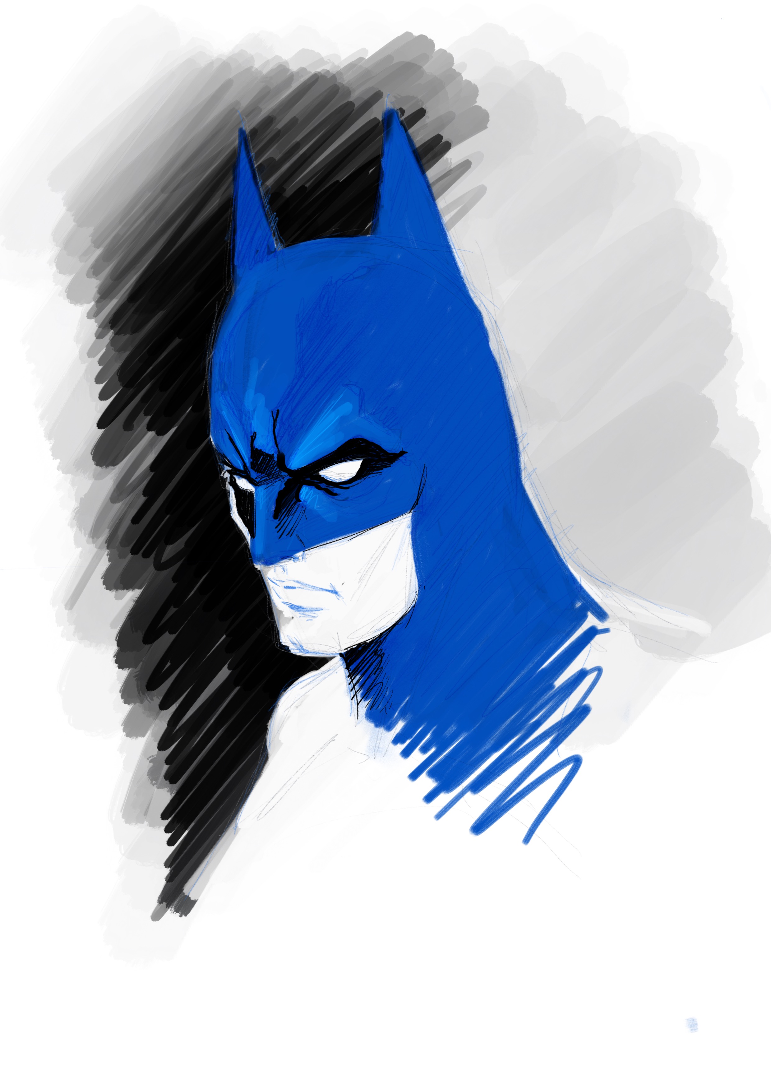
Apple Pencil test
I grew up up drawing the old fashioned way - pens, pencil and paper. Then the Mac came along and over the years less and less of my work involved 'real' illustration as everything has become digital. But still my desk is strewn with sheets of paper covered in notes, doodles and sketches. Every website design, every logo, everything, starts with a piece of paper and a pen.
In an effort to save the planet's trees and declutter my desk, I've tried just about every digital stylus available: Wacom, Adonit, Pencil by FiftyThree etc. You name it and I've wasted my money on it. But finally something has come along that might just change that...
Apple's imaginatively titled Pencil (thank God it wasn't the iPencil) combined with my iPad Pro has effectively replaced my real pad and pencil. I just create a page in the Notes app for each project and store all the relevant notes, sketches, links etc. there - much easier to manage than a pile of post-it notes and scraps of paper and it's available to me wherever I am.
To prove that Apple's Pencil is a capable replacement for a real pencil and paper (and that I'm a true geek at heart) here's a little something I prepared earlier - a quick drawing of Batman progressing from initial sketch to slightly more finished sketch. The pencil is responsive, the palm rejection is awesome and best of all, there's an undo command.