I thought some of you might be interested in the process of designing a corporate identity. In this case study I'm going to concentrate purely on the visual side of things, and ignore the equally important positioning side - the 'who are we and how do we say what we want to say' stuff...
Please bear in mind that this is a dramatic oversimplification and that the work shown shown below only represents a tiny fraction of the actual work involved!
Competitive Analysis
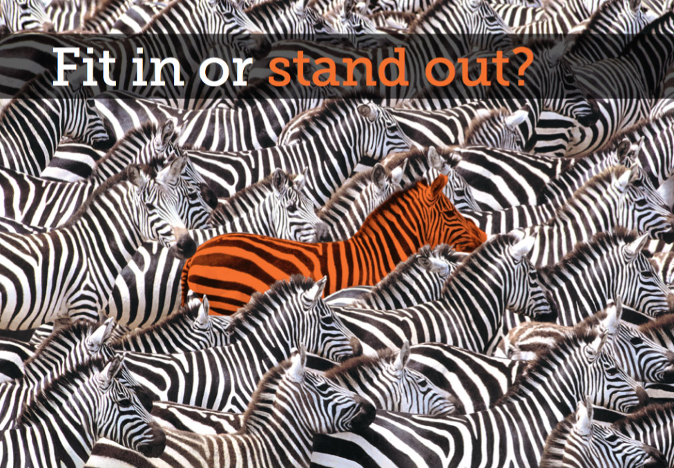
This basically involves looking at their competition and seeing how they fit in with them. One of the most important decisions any brand needs to make is whether they want to blend in with the rest or stand out from the pack.
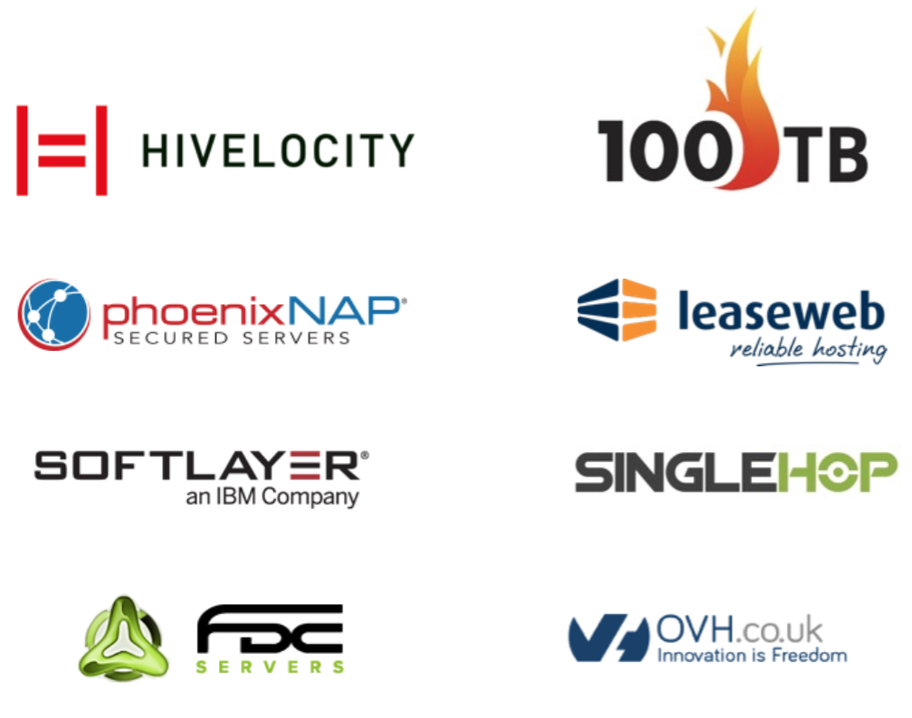
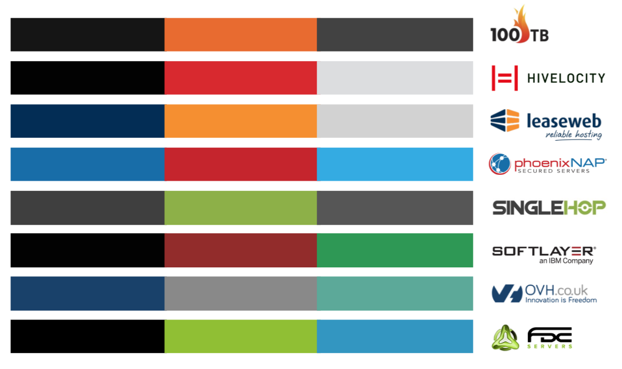
The first steps would be to collect and compare logos and other brand assets such as palettes and websites.
Initial Design Concepts
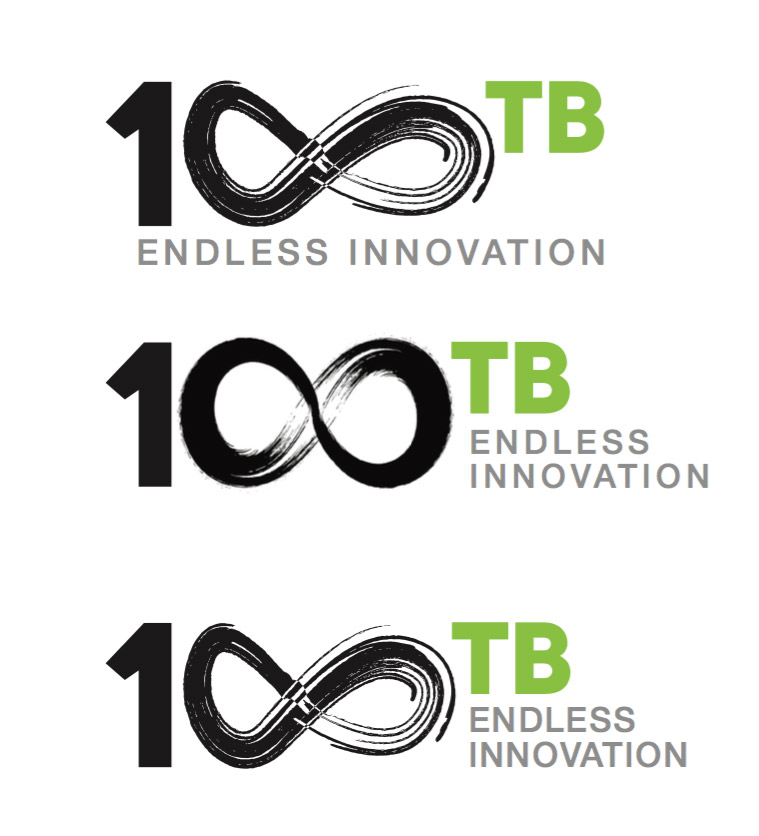
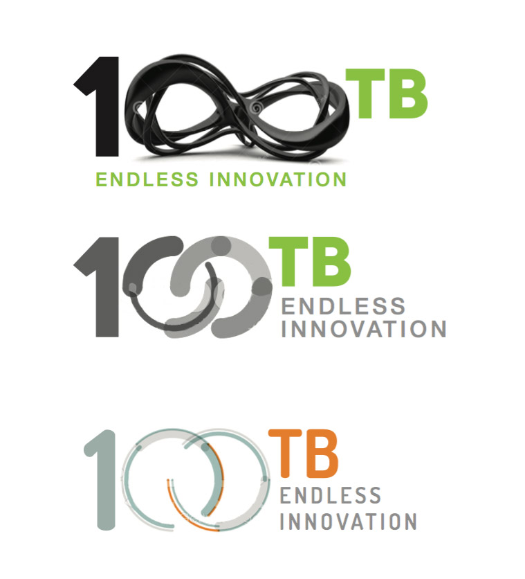
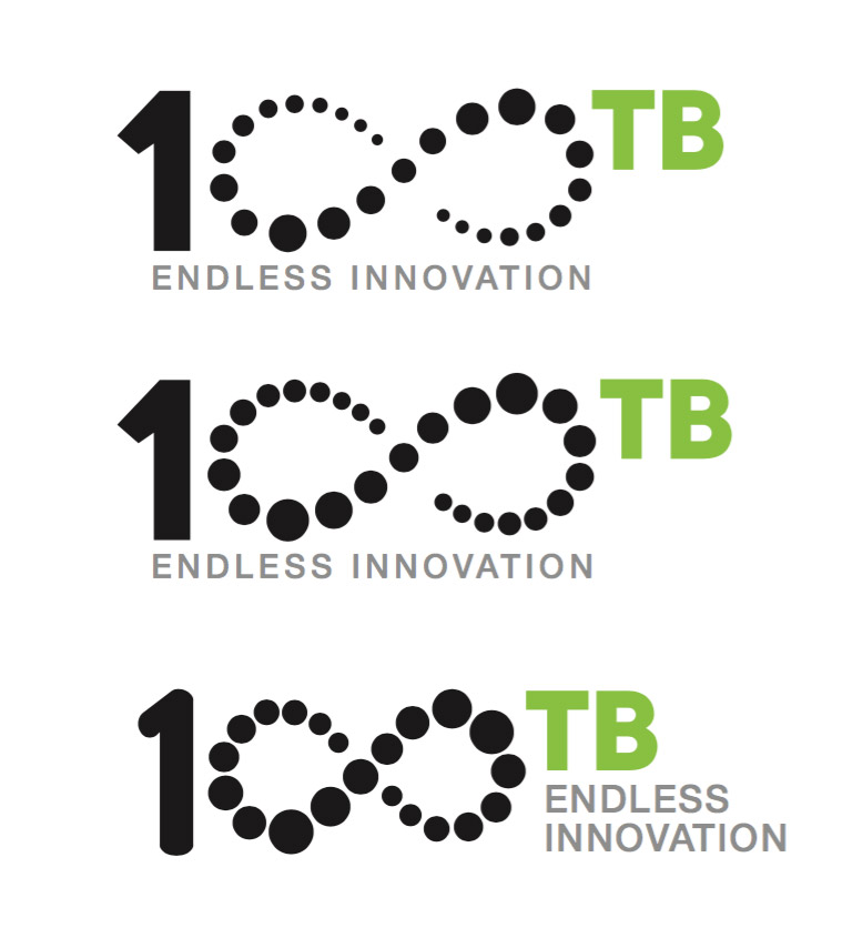
Once this process has been completed and discussed and some decisions have been made it's time to start coming up with some logo concepts. Obviously there's no end to how many ideas a client will want to see but you have to start somewhere, so it's a good idea to come up with several 'routes' and work from there.
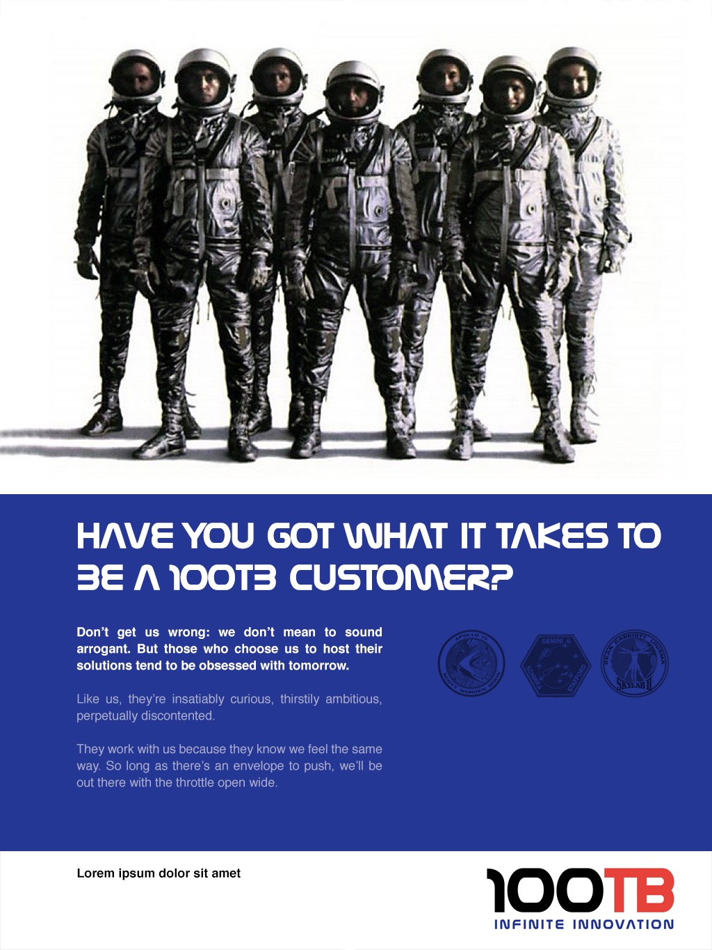
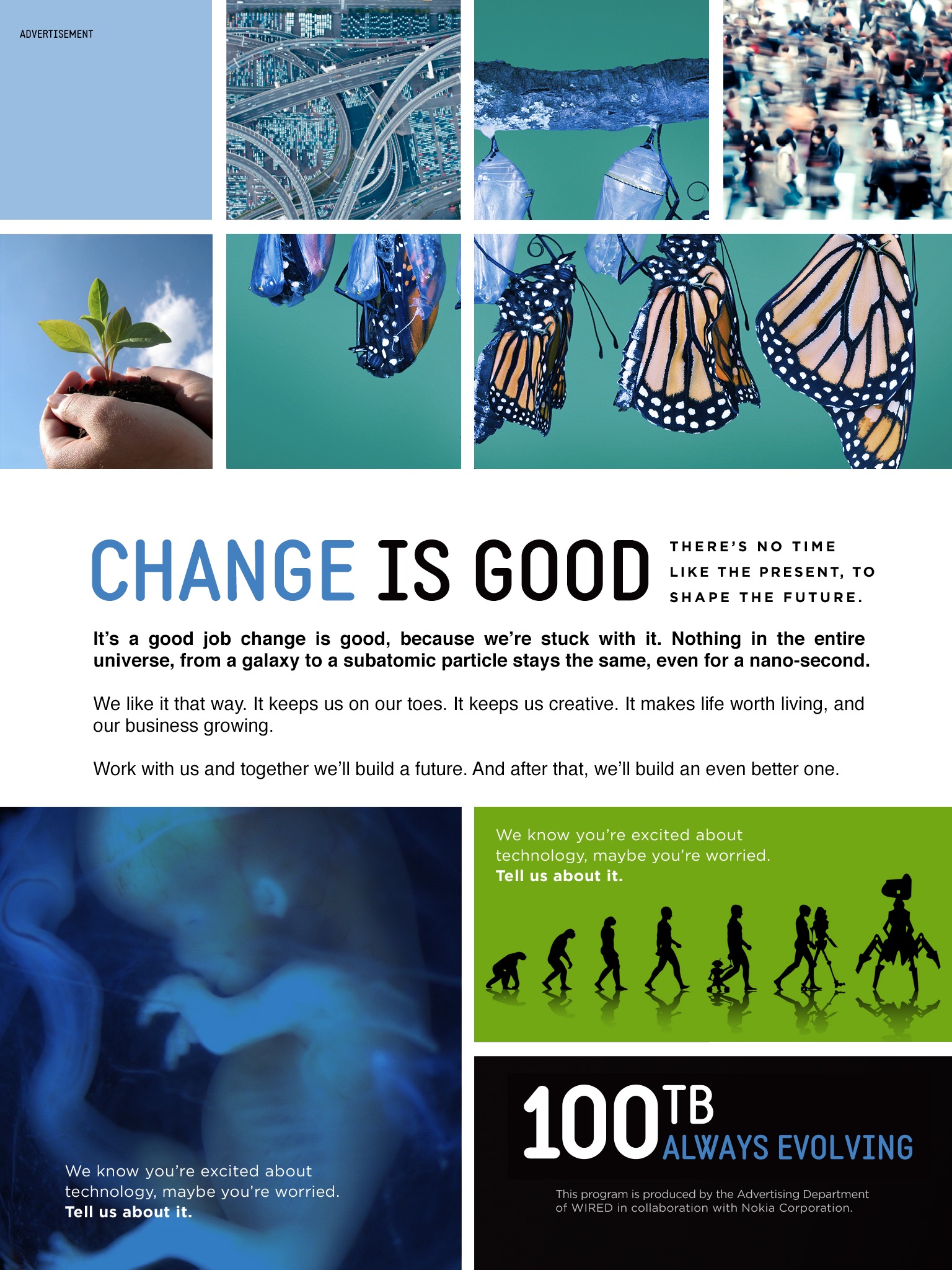
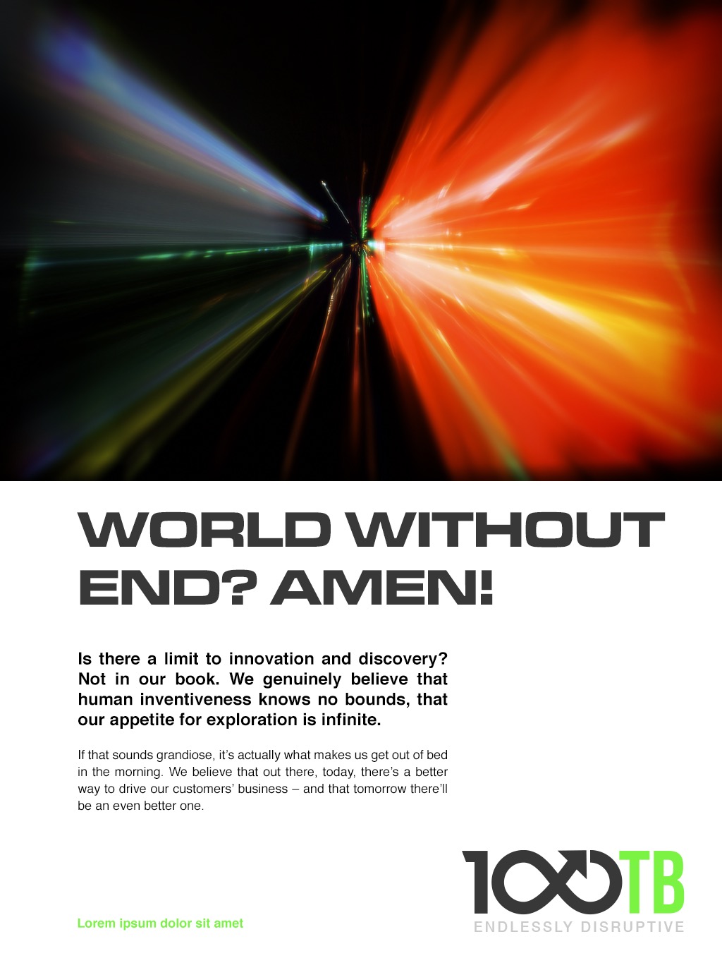
It's also helpful to visualise how some of these routes might be expressed later on and to give an idea of what the logos might look like in situ...
It's normally not a good idea to worry too much about colours and typefaces at this point as they can distract from the 'bigger picture' and can easily be changed later...
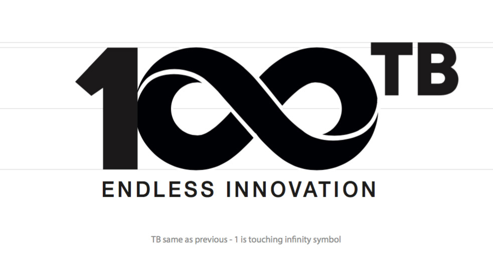
Hopefully something will catch their imagination (in this case the infinity symbol) and act as a catalyst for the next stage.
Polishing
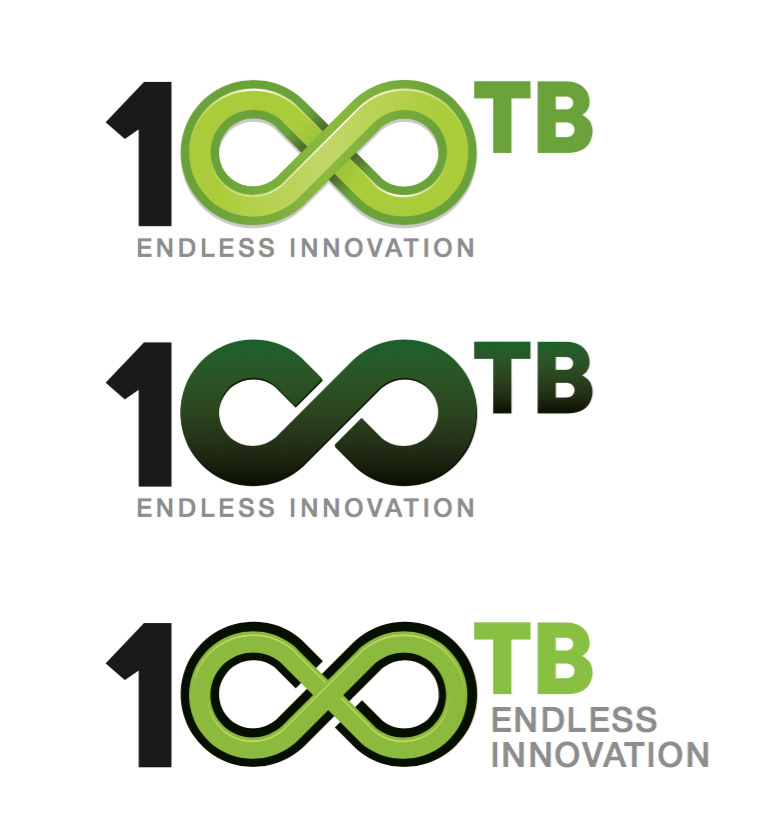
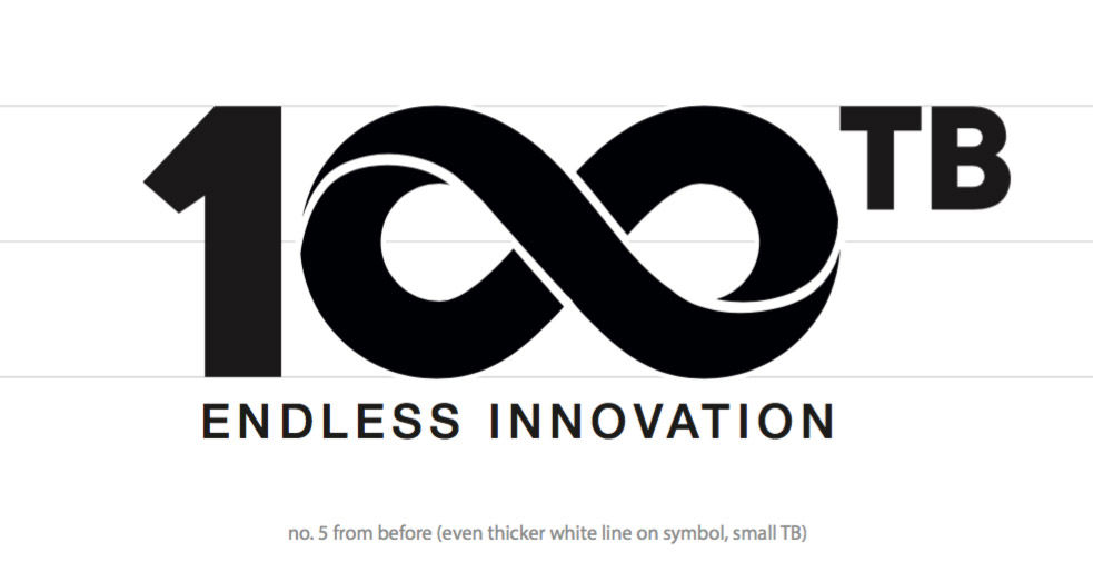
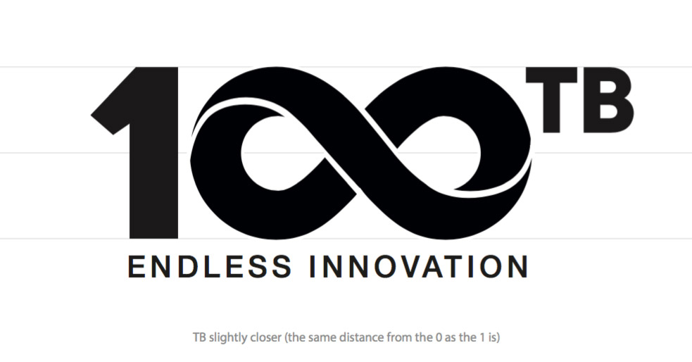
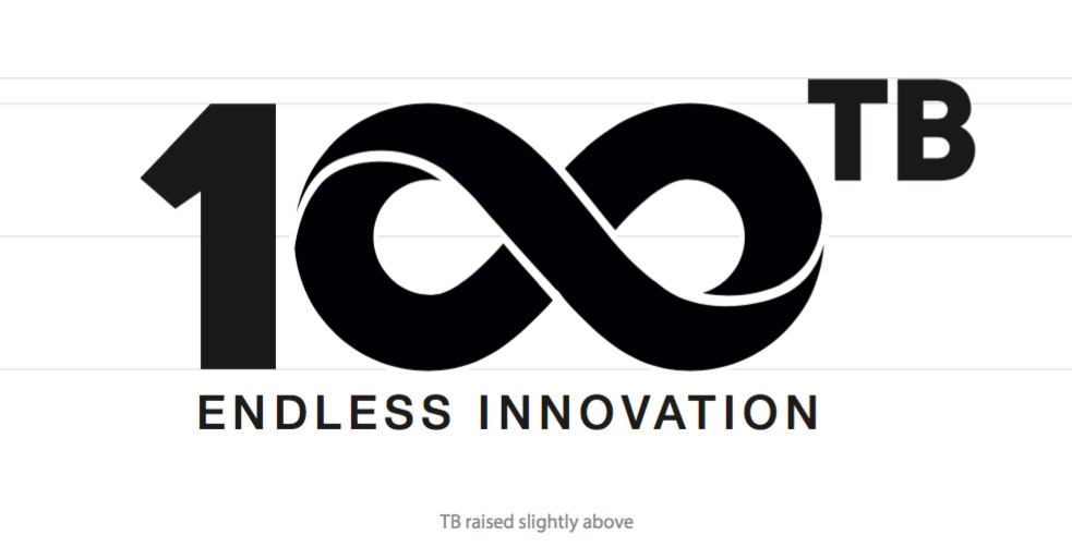
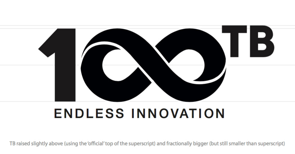
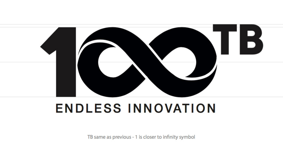
Once a logo has been chosen it's time to start polishing it, or as I like to think of it, 'variations on a theme'. It's incredible how tiny changes can make the difference between something that looks wrong or right.
Palette
Next, it's time to think about colours and mock up some examples of how they might be used in the real world. Typically this would involve the development of a primary set of colours for the actual logo itself and a secondary palette that will work with it.
And finally...
